
To fully understand conversion rate optimization (CRO) it’s vital to grasp both the art and science of this evolving discipline. The “art” of CRO means leveraging your empathy and instincts to understand your audience on an emotional and psychological level, and letting those sensibilities guide your strategy. The “science” of CRO means understanding best practices, testing methodology, and using data analytics to keep your approach grounded and results-oriented.
Feelings Matter, Even on Websites
If you only remember one thing from this article, let it be this guiding light:
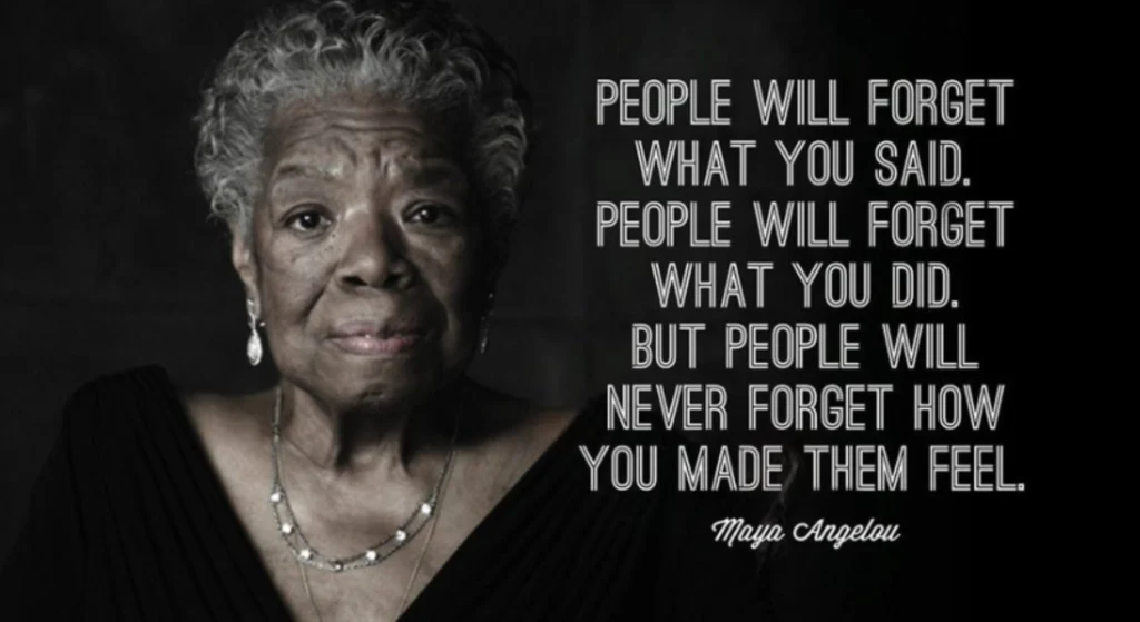
Maya’s words are wise. Her insight invokes a cognitive bias called the Empathy Gap, which is the idea that people make decisions based mostly on emotion more than logic.
Every point of your funnel—from entry point to landing page, from messaging to design, from tiny details to the overall experience—will generate feelings on the part of your prospect. They may not remember the color of your button or your exact headline or how many form fields they had to fill out, but they will remember how you made them feel. Will it be delighted, relieved, and motivated? Or frustrated, confused, and tired? Of course, these feelings affect conversion but they also resonate on a grander scale in the landscape of larger conversations — both customer’s internal monologue and public discourse, social media, and word of mouth. And those conversations are the most powerful CRO tool of all.
Your takeaway? Apply CRO to the entire customer journey, as each step is a potential point of abandonment or loss of trust—as well as a potential point of building confidence and reinforcing positive emotional perception.
What is CRO?
CRO stands for Conversion Rate Optimization and it is the practice of getting prospects to do what you want by offering them what they need. Technically, it is the process of testing to find ways to increase the percentage of prospects who purchase, sign up, fill out a form. or other actions.
But what is it, really? Many people believe it’s simply website optimization.

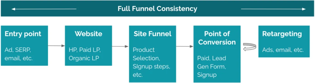
But CRO should be the optimization of every single touchpoint along the customer journey.
This approach invokes a cognitive bias called “Attentional Bias,” or “Availability Cascade.” Attentional bias refers to the tendency of our perception to be affected by our recurring thoughts or emotions. This bias can lead us to focus more on specific types of information while ignoring others, and influences how we make decisions. This basically means the more someone sees your offer, tagline, value prop, or anything else, the more likely they are to believe it and buy into it.
But that requires consistency. Any disruptions in the journey undermines that buildup. If you’re not consistent from ad to landing page, or landing page to checkout, then how can the customer believe that your final product will live up to your offer or claims?
What Parts of the Customer Experience Need CRO?
Some people believe CRO need only be applied to messaging, design, and CTAs.

However, it can and should go beyond that to every aspect of the customer experience.

All the aspects of your funnel feed into the customer’s emotions.
Overload of choices? They’ll feel overwhelmed.
Unclear messaging? Confused or distrusting.
Counter-intuitive UX? Feeble or frustrated.
Inconsistent experience? Dubious about your final product.
Don’t underestimate the power of the details, because you never know what detail will stand out and make an impact on your prospect.
Every detail must work together to nurture the same emotional output. This leverages the cognitive bias we just talked about: the empathy gap, which says that conversion is an emotional decision. Put that to work for you and be conscious of it. Make your story, your visuals, and your ux flow work together to generate positive emotions in your prospect.
This also invokes the cognitive bias known as the “Fluency Effect.” People like to feel “fluent” and proficient in navigating your funnel. It evokes a positive emotion of competency that will make them more likely to feel connected with your product and convert.
First impressions
Here’s the part that some marketers fail to connect: Subconsciously, the customer’s first impression of your funnel—not just the offer, but the user experience—largely determines their perception of your product. Just like any store or business whose exterior is falling apart, a bad first impression can undermine everything. Looking at the motel sign below. How clean do you think their rooms are?

It’s the same with your ads and website. If it is cluttered or confusing, then the customer will think your product and your customer service will be as well. If your website is clean, easy, and helpful, then customers are likely to expect the same of your product.
The Tornado of Distractions
When it comes to capturing customers’ attention, you’re not just competing with other companies. You’re competing with a tornado of distractions: FaceBook, Instagram, their 37 unread emails, and real-world distractions like their kid’s soccer practice in 45 minutes and that work project they need to finish. And definitely that other competitor whose website is clean and easy and fast.
Remember this: Your customer’s attention span is far less than you think. Make everything concise and clear or you risk losing them in the tornado of real-world distractions.
Your website is an obstacle
When a prospect lands on our website, we like to think … they’re joyfully stepping inside our wonderland, as excited as we are about our brand values and mission statement and the multitude of benefits that await them.
For the most part, they are not—at least not yet. They are only thinking about solving their own problem. And at this point, to them, your website is merely a necessary obstacle they must get past to solve their problem.
They’re pushing their nose against the glass to peek inside, and if they don’t see what they want quickly—in 3-5 seconds—they will leave, getting sucked back into that swirling tornado of competitors and distractions.
Your customers are complex beings
So, it’s crucial to understand your customers as complex human beings, not just marketing leads, so you can compel them to action. And that is the “Art of CRO.” It’s an art form of psychology, of design, of messaging, of imagery, and most importantly, of experience.

In a sense, CRO can be boiled down to that intangible essence of how your pieces all fit together in the customer’s brain to solve their problem—because that’s where all of this takes place. And your customer is most likely multitasking throughout it all. Let’s face it, we’re all stretched thin, and we’ve all got online fatigue. The more you understand that about your customer, the better you’ll connect with them to focus on their needs and compel them to convert.
Essential CRO Concepts
Let’s take a look at a few key concepts that form the foundation of CRO strategy.
Cognitive Load in Website Experiences
Cognitive load means how much mental effort is required to engage with or interact with something, be it an ad, social post, web page, checkout, and more. Generally, you should minimize cognitive load at every step (with some exceptions). If you make someone work too hard to find what they need on any page at any step, you may lose them.
- Messaging:
Always keep it simple yet relevant. Consider it from the customer’s point of view. How will you solve my problem? What do I need to do on this page to get what I want?
- UX:
Make it as clear and streamlined as possible with the fewest amount of choices to accomplish your goal. Less is more, but not always—test rigorously to find your sweet spot for the amount of friction that gets results.
- Visual:
Guide the customer’s eye. Use visual hierarchy, F & Z patterns, and progressive disclosure to regulate the amount of information a customer must take in to proceed. Remember, the ability for a customer to skip content they’re not interested in is as important as the ability to find content they want.
F & Z Patterns
To guide someone’s eye, it’s critical to understand how people physically consume content. Generally, their eyes move in an “F” pattern for copy heavy sites, or a “Z” pattern for more visual pages with min copy.
Guide their eye with your layout, story, actions, and design.
The 5-Second Rule
The 5-second rule means that within 5 seconds of landing on any page, the customer should be able to discern the “What-Why-How” —that is, what you offer, why they should want it, and how to get it.
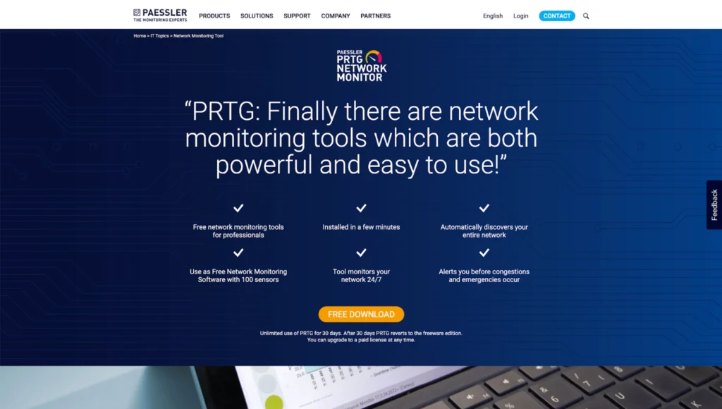
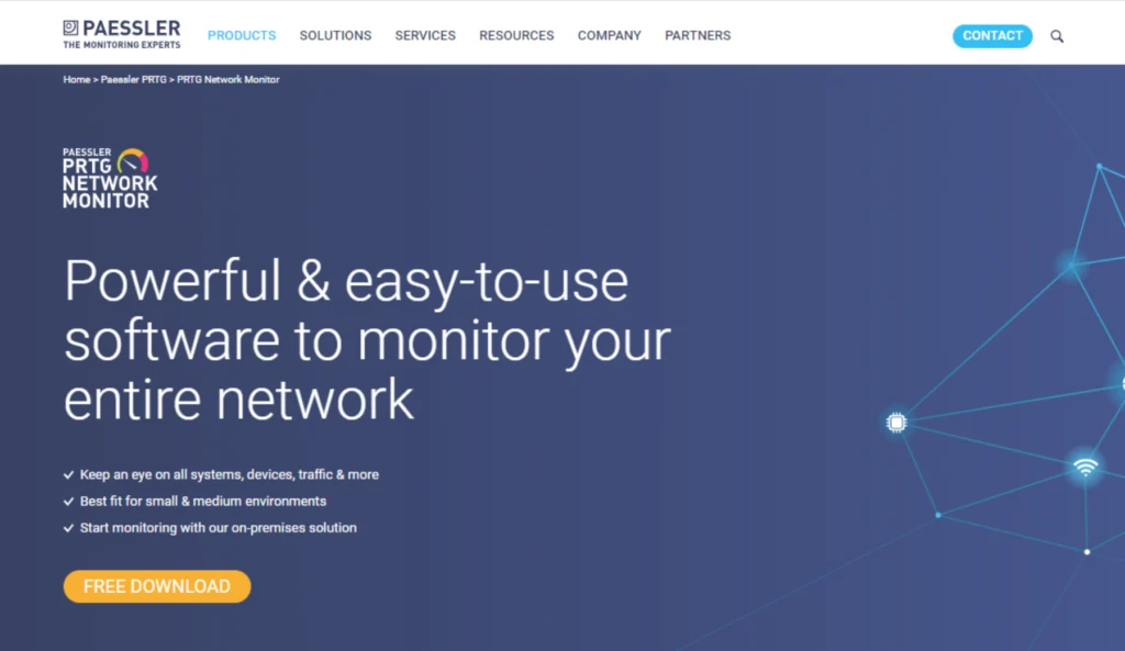
In the screenshots below, see how we helped Paessler optimize their product landing page by:
- Using a powerful hook in a quickly scannable headline
- Distilling their value propositions to short, easily consumed chunks
- Leveraging visual hierarchy to guide their eye and reduce cognitive load
Here’s the hard truth: From the customer’s point of view, your website is just a necessary hurdle to get what they want. We sometimes overvalue the “glory” of our product—after all, we put our heart & soul into it every day! Tell your story, but only enough to help the customer get what they need and progress toward conversion.
Before
After
The Best of CRO Best Practices
Let’s run through a few CRO best practices. This is not a comprehensive list, just a few highlights of my favorite tactics.
Powerful CTA (Clear & Compelling Call-to-Action)
Test things like button vs link, button shape and color, CTA wording, placement, and more.

Intuitive Design
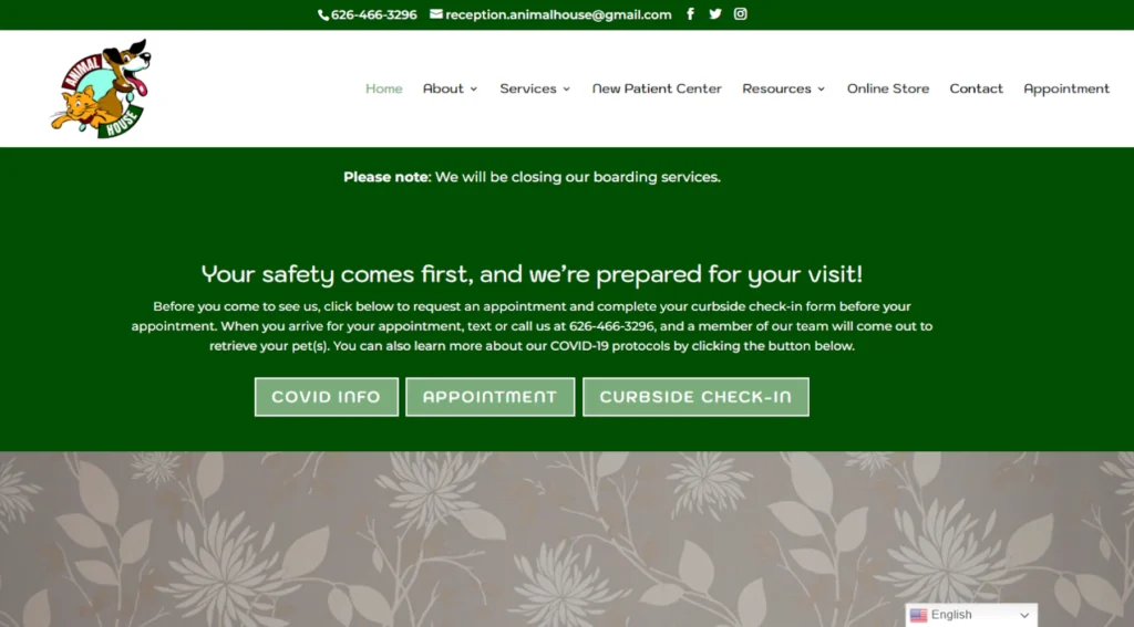
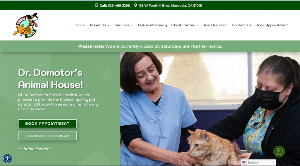
Guide their eye using F & Z patterns with easily scannable, bucketed content as well as imagery if appropriate. See an example below that shows how we optimized a website for Amerivet to boost engagement and click-through rates.
Before
After
Scannable UX
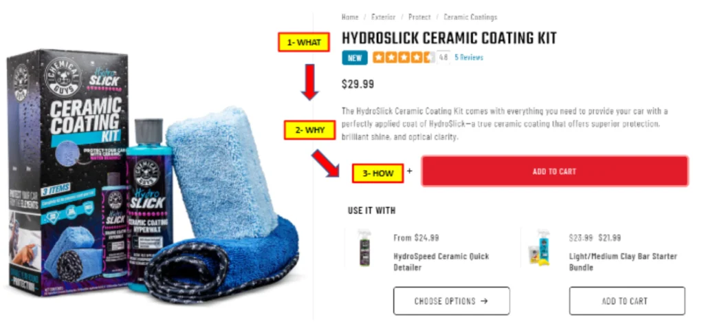
Make it easy. Optimize friction. Try to be invisible. Don’t force the user into a confusing cluster of content. Give them clean, easy chunks to read or skip. See the example below where we optimized the Chemical Guys product details pages.
Before
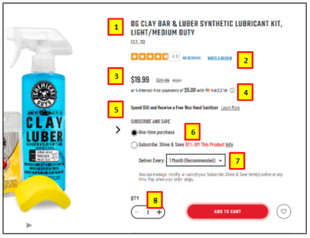
After
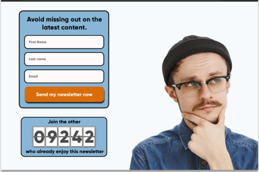
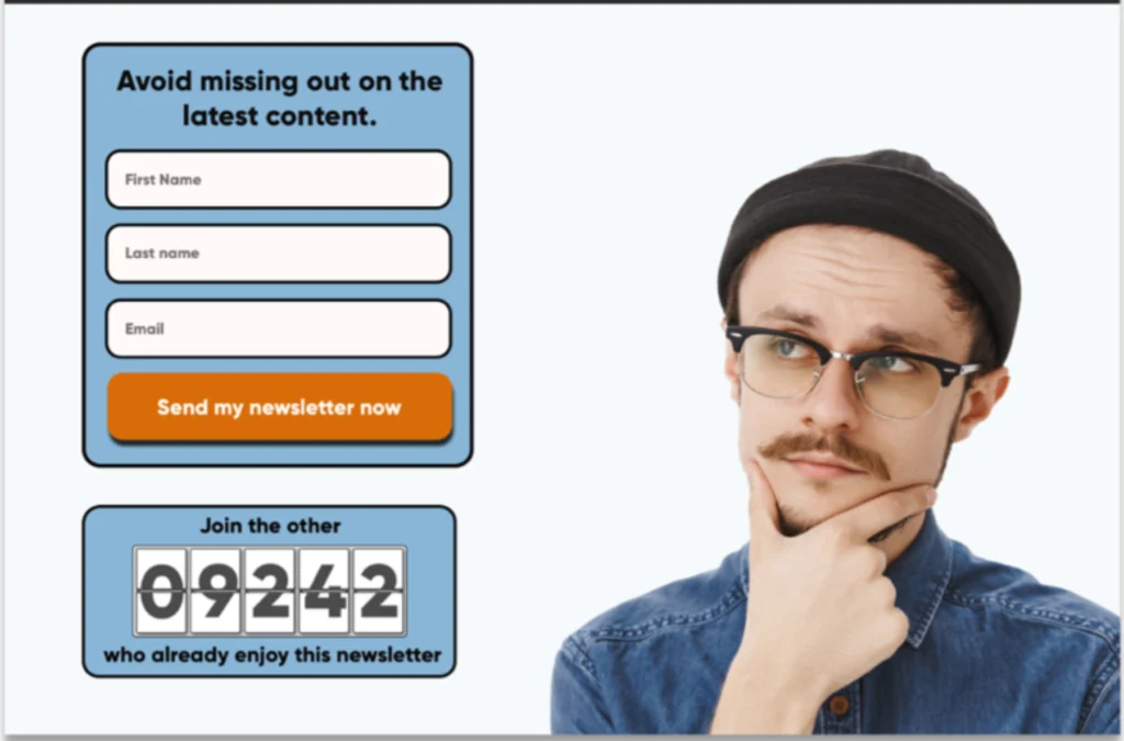
The Right Imagery
Images should be appropriate and compelling, but not distracting. If using a person, it’s optimal to have them looking at the desired CTA or directly at the camera. A product screenshot may also work if you see value in providing clarity of your offer to users.
Before
After
Helpful, Persuasive Messaging/Content
Drill down to the core emotion of your audience and leverage that to evoke emotions in them that will make your product memorable on an instinctive level. The goal is to connect emotionally (remember the “Empathy Gap”).


Value Propositions
Use empathy to think from the audience’s perspective and make sure all your messaging addresses “WIIFM” (What’s In It For Me?). Instead of describing your features, convey your benefits. Use differentiators to show how you are better than the competition.
Social Proof & Trust Signals
Solidify visitors’ trust in your company with social proof and trust signals. This can include testimonials, reviews, case studies, certifications, and other types of trust indicators. It gives you an air of legitimacy and can make visitors feel more confident in your product.

Relevance (Personalization & Segmentation)
Tailor your landing pages to cater to the visitor in terms of demographics, interests, or past behavior.
- Returning visitor? Use a greeting like “Welcome back, <name>”
- Product-specific ad or SERP meta? Make sure the landing page conveys that exact product in the most prominent position.
- Targeting a specific audience? Identify them at the top of the page so they know they’re in the right place.
Core Web Vitals
Ensure your website is performing at top capacity with your core web vitals. In fact, a study by Amazon found that every 100ms of load time cost them a 1% drop in sales. Visitors are impatient and have too many choices to wait for your site to load.
Mobile
This one is obvious, but worth mentioning. Ensure your site is mobile-friendly. These days, many visitors do initial browsing on a mobile device and then conduct transactions on a computer. If the mobile experience is clunky or slow, you’ll lose them right from the start.
Delight Your Customers
All of this can be synthesized into one simple concept: Aim to delight your customers. If you quickly show how you can solve their problem, they will happily convert. But beware. With all the distractions out there and our diminished attention span, the first sign of frustration or confusion can quickly cause your happy customer to turn into a lost customer.