It’s a proven fact: data is king. But the king cannot rule without the attention and dedication of the kingdom.
That’s why data visualization matters so much. It enables you to quickly focus your audience on the essential, most important data points, and tell the story of your data in a compelling way.
Here, we’ll give you creative tips to help you emphasize your findings and ensure your audience grasps what really matters by optimizing tables for maximum impact.

The Top Reasons to Love Tables for Data Visualization
A table is one of the most common ways to represent data, regardless of the business industry. They’re intuitive to read, easy to build, and uncommonly flexible when it comes to customization. Unlike most bar charts, line graphs, and pie charts, tables are not limited to a specific data type; they can contain numbers, words, symbols, or even a combination of multiple data types.
Table Terminology
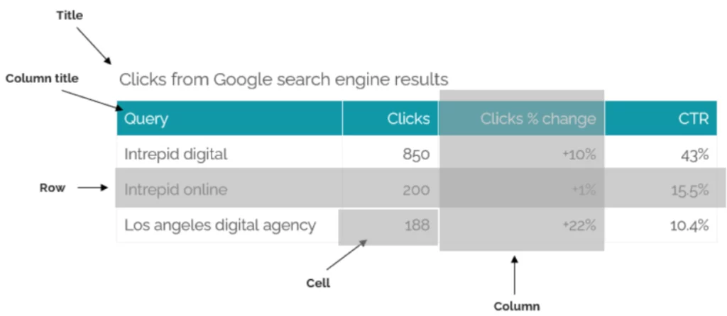
Our brains process tables differently from graphs. A table enables you to inspect and read data by scanning rows and columns. The data is displayed as text, whether words or numbers, and tables are usually reinforced by grid lines, which help the viewer focus on the arrangement of information.
Finally, unlike other graphs, tables may be used to display non-quantitative data, with written entries like the title of a blog, the author, or even something longer like a summary. Use tables to combine numerical entries and written text entries.
When Should You Use a Table in Data Visualization?
Tables offer one primary benefit that other types of charts don’t: they make it easy to view the exact values you want, quickly. Tables are a great way to display simple relationships between quantitative values and the categories to which these values are related, enabling granular reading of one or more specific values.
Whenever you need to enable precise reading of data, the textual encoding of tables is a great option. Exact numerical values can be displayed when you need that extra precision.
Another strength of tables is that they can include multiple sets of quantitative values that are expressed into different units of measure (ex: dollar amount, numbers, percentage, etc.).
Consider using a table when:
- Readers will want to look up values
- The quantitative information involves different types of measurement
- Multiple comparisons need to be addressed in a large set of data
- Measurements need to be precise OR entries might be verbose
When to Not Use a Table
However, using a table during a live presentation may not be the best approach, as it requires time and a lot of reading from your audience. Instead, you may highlight the main insight and add the table in an appendix.
How to Build a Clear and Compelling Table
Careful with the Grid Lines
Whenever you create a table, many tools provide a default grid line that is supposed to enhance the presentation of your data. Although a thick black grid line seems appealing to improve the legibility of your data, it may also divert your audience’s attention. This is problematic, as you want your audience to focus on the data, not the noise around it.
Take a look at the examples below and see how the manipulation of borders in the second and third iterations helps the data stand out more than the structural component of the table.
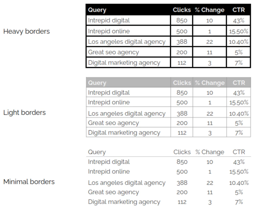
In the example above, borders are getting in the way and don’t add value or context to the chart.
Table designs can (and must) fade into the background, helping the viewer to focus on the data.
Use Preattentive Attributes
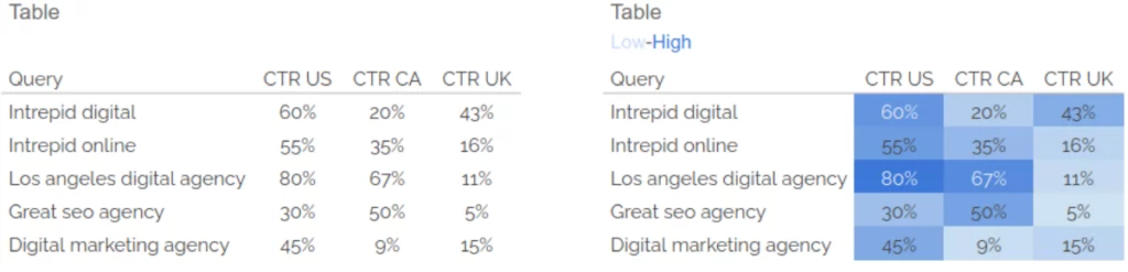
Once your table is built, you might want to add some preattentive visual properties, which the fancy term for color-coding or highlighting.
What are Preattentive Attributes?
Preattentive attributes, also known as preattentive visual properties, are visual characteristics that the human brain can quickly and automatically process without the need for focused attention. These attributes are recognized effortlessly and rapidly, often within milliseconds, allowing for the rapid perception of patterns and information in visual stimuli.
Preattentive processing occurs before conscious attention is fully engaged. They are an important aspect of data visualization because they enable us to redirect the viewer’s attention toward the most important information in our visual representation of data.
Preattentive Attributes in Tables
In the beautiful world of tables, we’ll focus on two types of preattentive attributes that are commonly used:
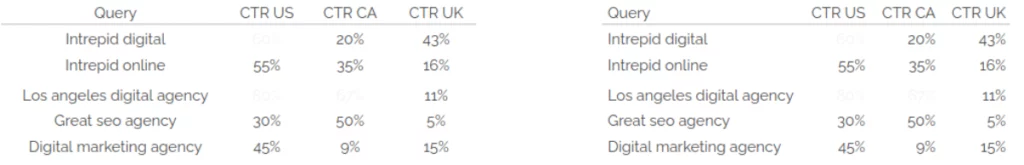
Data highlight (highest or lowest): If you have a table with a lot of data for different categories, highlight the lowest or the highest value to help the audience find them quickly. For example, it will take you some time to determine the highest values on this table.
| Query | Clicks | Clicks % change | CTR |
|---|---|---|---|
| Intrepid digital | 850 | +10% | 43% |
| Intrepid online | 500 | +1% | 15.5% |
| Los angeles digital agency | 388 | +22% | 10.4% |
| Great seo agency | 200 | +10% | 5% |
| Digital marketing agency | 112 | +3% | 7% |
| Best seo agency US | 150 | +20% | 8% |
| Serious seo companies | 290 | +17% | 20% |
But with this version, it’s suddenly much easier, isn’t it?
| Query | Clicks | Clicks % change | CTR |
|---|---|---|---|
| Intrepid digital | 850 | +10% | 43% |
| Intrepid online | 500 | +1% | 15.5% |
| Los angeles digital agency | 388 | +22% | 10.4% |
| Great seo agency | 200 | +10% | 5% |
| Digital marketing agency | 112 | +3% | 7% |
| Best seo agency US | 150 | +20% | 8% |
| Serious seo companies | 290 | +17% | 20% |
Heatmap: Use colors and color saturation to represent data values. Simply put, it’s a table with color-coded cells where each color variation/intensity is associated with the magnitude of the number.
By using color saturations, we help our eyes more quickly target the main point of interest within a table, as well as the comparisons between values.
Use the Correct Alignment for Your Data
“The most effective alignment of text is primarily a matter of convention rather than the mechanics of visual perception,” explains Stephen Few in his book Show Me the Numbers. These conventions are quite powerful, so ignoring them may lead to confusion.
There are five rules to keep in mind when aligning data into a table:
- Numerical data should be right-aligned (easier to read).
- Dates are best aligned to the left, using the format that uses a number in each portion of the date (ex: MM/DD/YY).
- Other text data should be left-aligned.
- Table headers should be aligned with their data.
- Do not use center alignment (even if it’s tempting and your tool does it by default).
In summary, leveraging tables creatively and strategically can help you more profoundly connect your audience with your data. It’s vital to customize every aspect of your table to highlight the essential elements of your data. And since data serves as the ultimate validation of your work, it makes sense to beautify and clarify your data for maximum impact.
Additional Resources
- Show Me the Numbers by Stephen Few
- Better Data Visualizations by Jonathan A. Schwabish
- Storytelling With Data by Cole Nussbaumer Knaflic
- Data Visualisation: A Handbook for Data Driven Design by Andy Kirk